Device Visibility lets you control whether specific email content appears on mobile, desktop, or both. This is useful when certain elements or layouts should be device-specific without being deleted from the email. You can also combine Device Visibility with Mobile Formatting and Conditional Visibility to create more flexible responsive email experiences.
TABLE OF CONTENTS
- What is Device Visibility in the Email Builder?
- Key Benefits of Device Visibility
- Element Visibility vs. Layout Visibility
- Device Visibility vs. Mobile Formatting
- Device Visibility vs. Conditional Visibility
- How Visibility Settings Work
- Common Device-Specific Design Patterns
- Best Practices for Device Visibility
- How to Hide an Email Element on Mobile or Desktop
- How to Hide an Entire Layout
- How to Preview and Test Visibility Settings
- Frequently Asked Questions
- Related Articles
What is Device Visibility in the Email Builder?
Device Visibility controls whether an email element or layout is shown on desktop, mobile, or both. It is a presentation setting, so hiding content for a device does not delete the content from the email builder.
You can use Device Visibility to:
Hide an element on mobile.
Hide an element on desktop.
Show separate desktop and mobile versions of content.
Hide an entire layout for one device type.
Keep complex desktop layouts from appearing on smaller screens.
HighLevel email elements are responsive by default, so Device Visibility is best used when content should not appear at all on a specific device.
Key Benefits of Device Visibility
Device Visibility gives you more control over which content recipients see on different screen sizes without requiring separate email campaigns.
Device-specific content: Show different content on mobile and desktop when needed.
Cleaner mobile layouts: Remove nonessential or overly complex desktop content from smaller screens.
Simplified responsive design: Use separate layout versions when one design does not translate well across
devices.Flexible content management: Keep hidden content in the builder so it can still be edited or reused.
Better control: Combine element visibility, layout visibility, and Mobile Formatting for more precise responsive email design.
Element Visibility vs. Layout Visibility
Element Visibility and Layout Visibility control different levels of the email structure. Choosing the right one helps avoid unnecessary duplicate settings and makes troubleshooting easier.
Element Visibility
Use Element Visibility when only one content element should be hidden.
Examples include:
Text
Images
Buttons
Dividers
Icons
Other supported Email Builder elements
For example, you might hide a decorative banner on mobile while keeping the rest of the section visible.
Layout Visibility
Use Layout Visibility when an entire group of elements should be hidden together.
This is useful when:
A desktop layout has multiple columns.
You created a separate mobile-friendly version.
A complete promotional section should only appear on one device type.
If a parent layout is hidden for a device, the elements inside that layout do not render for that device even if their own element-level visibility settings are enabled.
Device Visibility vs. Mobile Formatting
Device Visibility and Mobile Formatting solve different responsive-design problems. Understanding the difference helps you choose the correct setting. Use Device Visibility when the content should not appear at all on a device.
Use Mobile Formatting when the content should remain visible but look different on mobile.
For example:
Hide a decorative image on mobile → use Device Visibility.
Keep the image visible but adjust its spacing → use Mobile Formatting.
Hide a desktop-only CTA → use Device Visibility.
Keep the CTA but change its alignment or mobile styling → use Mobile Formatting.
Device Visibility vs. Conditional Visibility
Device Visibility controls content based on the recipient's device, while Conditional Visibility controls content based on contact information or other supported conditions.
Use Device Visibility for:
Desktop-only content
Mobile-only content
Device-specific layouts
Use Conditional Visibility for:
Contact-specific content
Personalized messaging
Content shown or hidden based on contact fields or rules
For advanced personalization, refer to the dedicated Conditional Elements documentation.
How Visibility Settings Work
Visibility settings determine which content HighLevel includes for the selected device experience. Reviewing both the element and its parent layout is important because parent visibility can override child settings.
Visible on Desktop and Mobile
Use this configuration when the element or layout should appear everywhere.
Hidden on Mobile
Use this when the content should appear on desktop but not on mobile.
Hidden on Desktop
Use this when the content should appear on mobile but not on desktop.
Hidden Layouts
When a layout is hidden for a device, the content inside that layout does not render for that device. If a layout is hidden on both desktop and mobile, it is not included in those views.
HighLevel uses visual indicators, such as grayed-out device icons, to show when a layout is hidden for a device.
Common Device-Specific Design Patterns
Device Visibility is most useful when the mobile and desktop experiences genuinely need different content structures. Avoid creating separate versions of every element when normal responsive behavior already works.
Simplify a Complex Desktop Layout
For example:
Desktop
Three-column promotional layout
Mobile
Separate single-column layout
You can:
Hide the desktop layout on mobile.
Hide the mobile layout on desktop.
Hide Nonessential Decorative Content
Large decorative images or banners may take up too much space on smaller screens. Hide them on mobile while keeping the core message and CTA visible.
Create Device-Specific Calls to Action
If a CTA needs a different layout or presentation on mobile, create separate versions and use Device Visibility to show the appropriate one.
Best Practices for Device Visibility
Device-specific content should improve usability without creating gaps in the message or hiding information recipients need.
Use responsive design first before creating duplicate desktop and mobile content.
Hide only content that is genuinely unnecessary for the selected device.
Check parent layout visibility when troubleshooting an element.
Keep critical campaign information available on all relevant devices.
Avoid hiding compliance or legally required content.
Test both device versions before sending.
Do not hide required information such as:
Unsubscribe links
Required business details
Legal notices
Essential pricing or terms
unless equivalent compliant information remains visible.
How to Hide an Email Element on Mobile or Desktop
Using the Visibility settings lets you control device-specific display without deleting the element from your email.
Navigate to Marketing > Emails.
Open an existing campaign or template, or create a new one.
Open the email in the Email Builder.
Select the element you want to configure.
Open the Visibility tab.
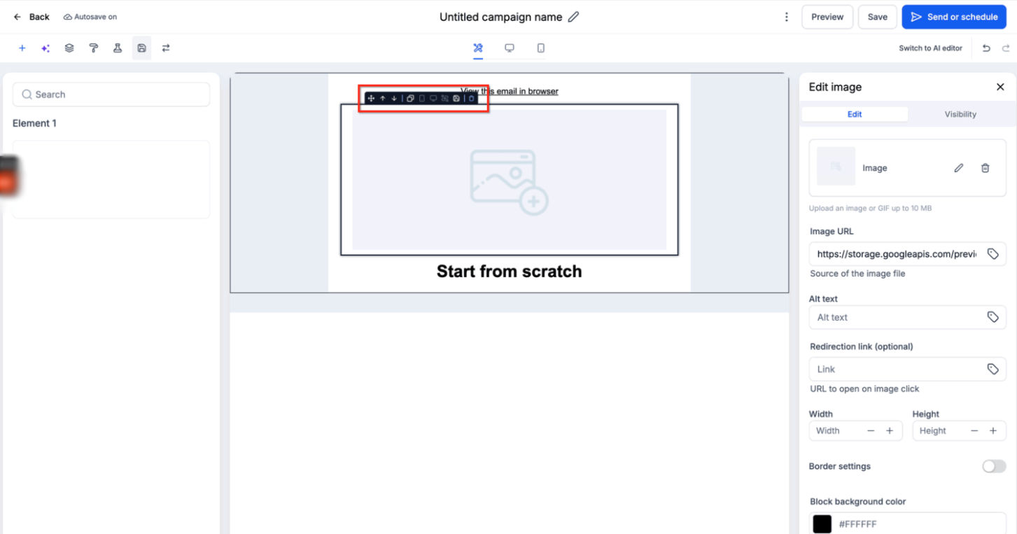
Locate the Device-Based Visibility settings.
Choose whether the element should be visible on:
Desktop
Mobile
Both
Disable the relevant device when the element should be hidden there.
Save the email.
Preview both Desktop and Mobile versions to confirm the result.
How to Hide an Entire Layout
Layout Visibility is useful when several related elements should be hidden together instead of configuring each element individually.
Select the layout you want to configure.
Open the layout's Visibility settings or use the available device visibility icons.
Choose whether the layout should appear on Desktop, Mobile, or both.
Confirm the appropriate device icon reflects the hidden state.
Save the email.
Preview both device views.
Remember: if a layout is hidden for a device, the visibility settings of elements inside that layout will not override the parent layout.How to Preview and Test Visibility Settings
Preview helps you check the intended layout in the builder, while a test send confirms how the email appears in a real inbox.
Preview Device Visibility
Open the email preview.
Review the Desktop view.
Review the Mobile view.
Use Tablet preview as an additional layout check.
Confirm:
desktop-only content is hidden on mobile,
mobile-only content is hidden on desktop,
layouts appear as intended,
important content remains available.
Send a Test Email
After previewing:
Use Send Test.
Send the email to a real inbox.
Open it on both desktop and mobile devices.
Confirm the visibility rules behave as expected.
Test emails preserve supported visibility settings, making them useful for checking real-world rendering before launch.
Frequently Asked Questions
Q: Does hiding an element delete it from the email?
No. Device Visibility controls whether the content appears for the selected device. The element remains in the Email Builder so you can continue editing it.
Q: Can I hide an element only on mobile?
Yes. Disable mobile visibility while keeping desktop visibility enabled.
Q: Can I hide an element only on desktop?
Yes. Disable desktop visibility while keeping mobile visibility enabled.
Q: Can I hide an entire layout?
Yes. HighLevel supports device visibility for layouts as well as individual elements.
Q: What happens if the parent layout is hidden?
Elements inside that layout do not render for that device, even if their individual element visibility settings are enabled.
Q: Is Device Visibility the same as Mobile Formatting?
No. Device Visibility determines whether content appears. Mobile Formatting changes how visible content looks on mobile.
Q: Can I use Conditional Visibility with Device Visibility?
Yes, where supported. Device Visibility is device-based, while Conditional Visibility uses contact data or other conditions. Review both settings when troubleshooting personalized content.
Q: Why is an element still hidden even though its own visibility is enabled?
Check the parent layout. If the layout is hidden for that device, its child elements will not render.
Q: Do visibility settings apply to test emails?
Yes. Supported visibility settings are preserved in test and live emails.
Q: Does hiding an element leave blank space?
Current HighLevel documentation does not define this behavior universally for every individual element. Preview and send a test email to verify spacing for your specific design.
Q: Does hiding a linked element affect click tracking?
Current HighLevel documentation does not explicitly define tracking behavior for hidden linked elements. Test the intended campaign behavior before relying on a device-specific tracking scenario.
Related Articles
Was this article helpful?
That’s Great!
Thank you for your feedback
Sorry! We couldn't be helpful
Thank you for your feedback
Feedback sent
We appreciate your effort and will try to fix the article