Product Media Layouts for the Product Details Page in HighLevel
Product Media Layouts let you control how product images, videos, and galleries appear on your Product Details Page. You can choose between carousel, grid, and stacked layouts, configure zoom behavior, and enable keyboard shortcuts for faster image browsing.
This guide covers all available layout options, image zoom settings including the new keyboard navigation feature, and step-by-step instructions for configuring media layouts in your HighLevel store.
Understanding Product Media Layouts
Product Media Layouts control the visual presentation of images and videos on your Product Details Page. These layouts are configured through the Product Details element in your store's Page Builder and apply to both default and custom Product Details Pages.
Each layout option offers a different way to showcase product media, from simple single-image displays to interactive carousels with thumbnail navigation. Combined with zoom settings and keyboard shortcuts, media layouts give shoppers multiple ways to explore product details before purchasing.
Choosing the right media layout improves conversion rates by letting customers view products from multiple angles, zoom into details, and navigate images quickly with mouse, touch, or keyboard controls.
Available Layout Options
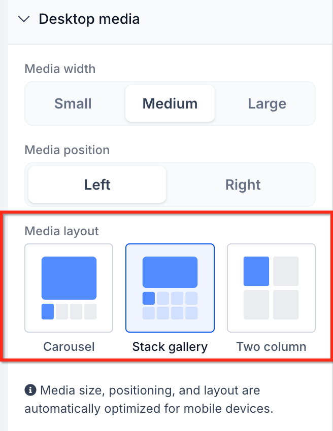
HighLevel provides several Product Media Layout options to match your store's design and the type of products you sell. Each layout offers different navigation styles and visual presentation.
Displays a large hero image with a thumbnail strip below or beside it. Shoppers click thumbnails to change the main image, or use arrow buttons to cycle through the gallery. This layout works well for products with multiple angles or lifestyle shots.
Shows all product images in a grid format, allowing customers to see multiple images at once without scrolling through a carousel. Best for products with a moderate number of images (3–6) where side-by-side comparison is helpful.
Arranges images vertically in a scrollable column. Customers scroll down to view all images in sequence. This layout works well on mobile devices and for products with many detail shots or instructional images.
Displays one primary product image with optional zoom. Ideal for simple products, digital goods, or minimalist store designs where a single hero shot is sufficient to convey product value.
Layout availability and naming may vary based on your HighLevel version and theme. Check your Store Builder's Product Details element settings for the exact layout options available in your account.
Image Zoom Settings
Image Zoom controls how customers interact with product images when they want to see more detail. HighLevel offers three zoom behaviors that work across all Product Media Layouts.
Clicking a product image opens a fullscreen lightbox overlay with zoom controls, navigation arrows, and a thumbnail strip. This option provides the most immersive browsing experience and supports keyboard navigation shortcuts for faster image browsing.
Best for: Stores with high-quality product photography, fashion, jewelry, electronics, or any product where detailed inspection increases buyer confidence.
Clicking or hovering over an image triggers an inline zoom effect that magnifies the image within the Product Details Page layout, without opening a separate overlay.
Best for: Stores that want zoom functionality but prefer to keep customers on the product page without modal interruptions.
Product images are displayed at their default size with no zoom interaction. Clicking an image has no special behavior unless configured separately.
Best for: Digital products, services, or stores with simple product imagery where zoom is unnecessary or would add friction to the buying process.
Open Lightbox is the only zoom mode that supports keyboard navigation shortcuts (Escape, Arrow keys). If you want to offer keyboard-friendly browsing, choose Open Lightbox as your Image Zoom setting.
Keyboard Navigation for Open Lightbox
When Image Zoom is set to Open Lightbox, customers can use keyboard shortcuts to navigate product images faster and more efficiently. This feature is especially valuable for desktop users, power shoppers, and customers who prefer keyboard-only navigation for accessibility reasons.
Supported Keyboard Shortcuts
The following keys are active when a customer clicks a product image and the Open Lightbox zoom opens:
How Keyboard Navigation Works
When the lightbox opens, it automatically receives keyboard focus. Customers can immediately press Escape or Arrow keys without clicking inside the lightbox first. This removes friction and makes navigation instant.
Pressing Right Arrow on the last image jumps to the first image. Pressing Left Arrow on the first image jumps to the last image. This continuous loop lets customers explore all images without hitting a dead end or needing to reverse direction manually.
While the lightbox is open, arrow keys no longer scroll the page behind the popup. All keyboard input is reserved for controlling the image gallery. This prevents accidental page movement and keeps focus on product browsing.
As customers navigate with arrow keys, the thumbnail strip automatically scrolls to keep the active thumbnail visible. The currently displayed image is highlighted in the thumbnail strip, providing clear visual feedback of position within the gallery.
Mouse and Touch Interactions (Unchanged)
Keyboard shortcuts are added on top of existing lightbox controls. All familiar mouse and touch interactions continue to work normally:
- Clicking arrow buttons still navigates between images
- Clicking thumbnails still jumps directly to that image
- Clicking the close icon still exits the lightbox
- Zoom in/out and reset controls remain available
- Grid or view toggle controls remain unchanged
Keyboard navigation supports customers who rely on keyboard-only workflows, improves compliance with accessibility best practices, and creates a faster browsing experience for power users who prefer keyboard shortcuts over mouse clicks.
How to Configure Product Media Layouts
Product Media Layouts and Image Zoom settings are configured through the Product Details element in your store's Page Builder. Follow these steps to set up your preferred layout and enable keyboard navigation.
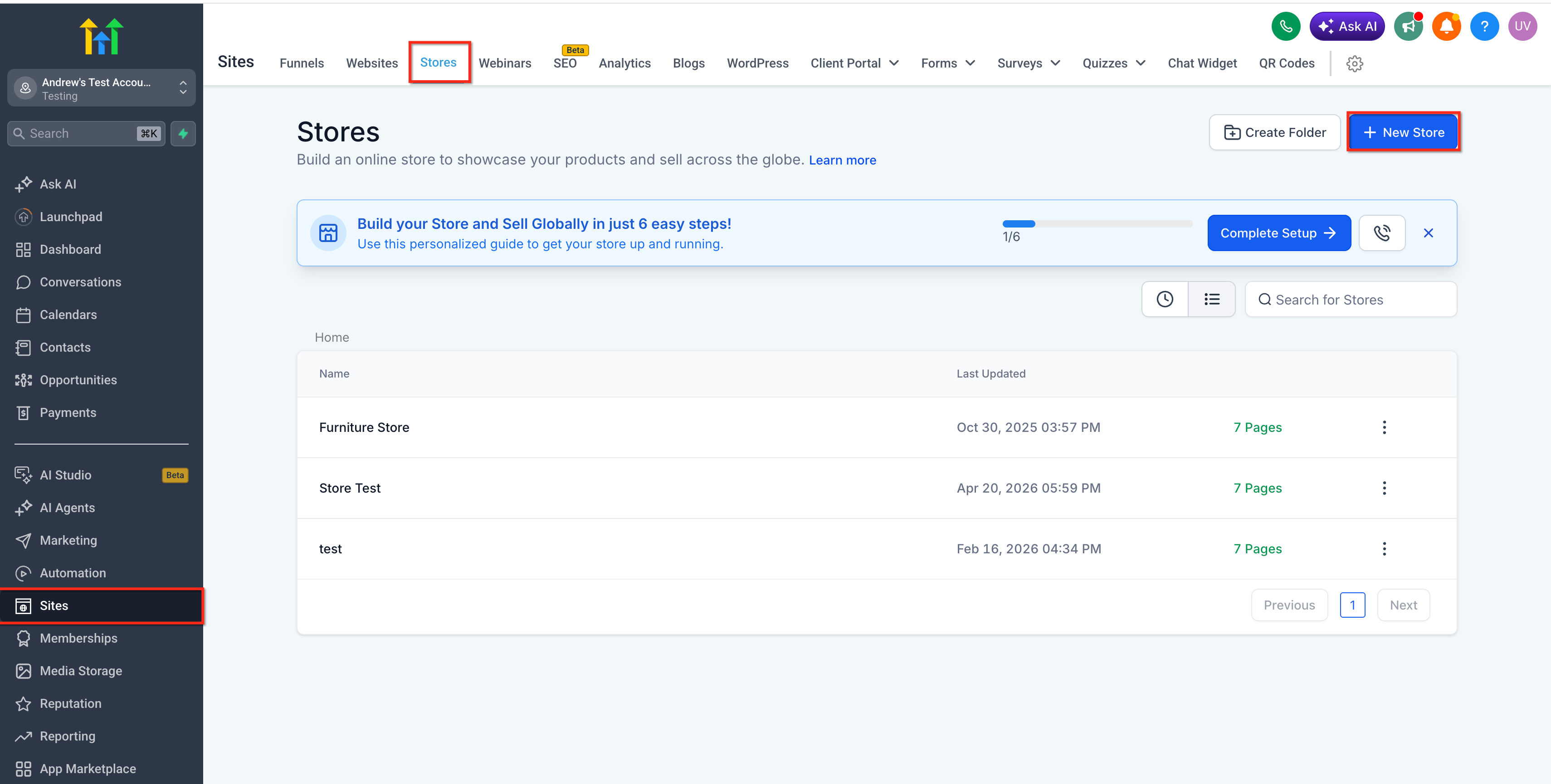
In your HighLevel account, go to Sites → Stores. Select the store that contains the Product Details Page you want to configure.
From your store's page list, click to edit the Product Details Page (or your Custom Product Details Page if you've created a custom PDP). The page will open in the Page Builder editor.
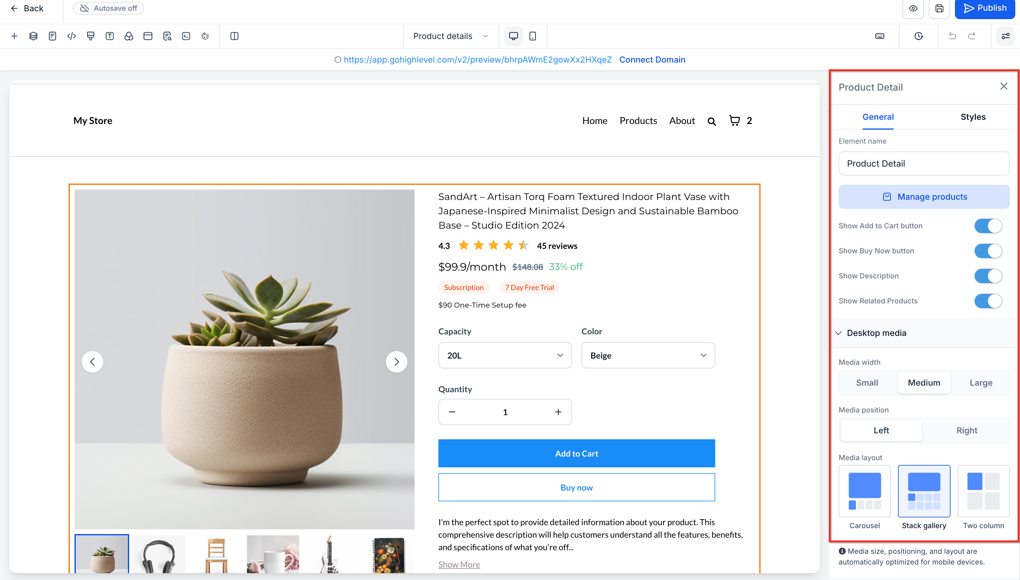
Click on the Product Details or Product element that displays your product images and information. This element controls all media layout and zoom settings for the page.
In the element settings panel (usually on the right side of the builder), locate the Product Media Layout or Desktop Media section. Select your preferred layout from the available options (e.g., Carousel with Thumbnails, Grid Gallery, Stacked Vertical, Single Image).
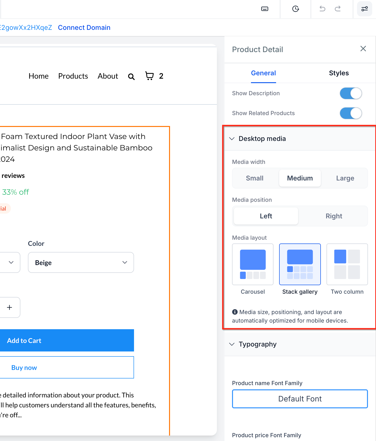
Find the Image Zoom dropdown in the settings panel. Choose from Open Lightbox, Click & Hover Zoom, or No Zoom. To enable keyboard navigation shortcuts, select Open Lightbox.
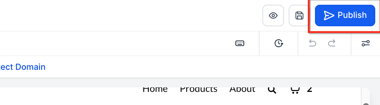
Click Save in the Page Builder, then click Publish to push your changes to the live store. Your new media layout and zoom settings will now apply to all products on that Product Details Page.
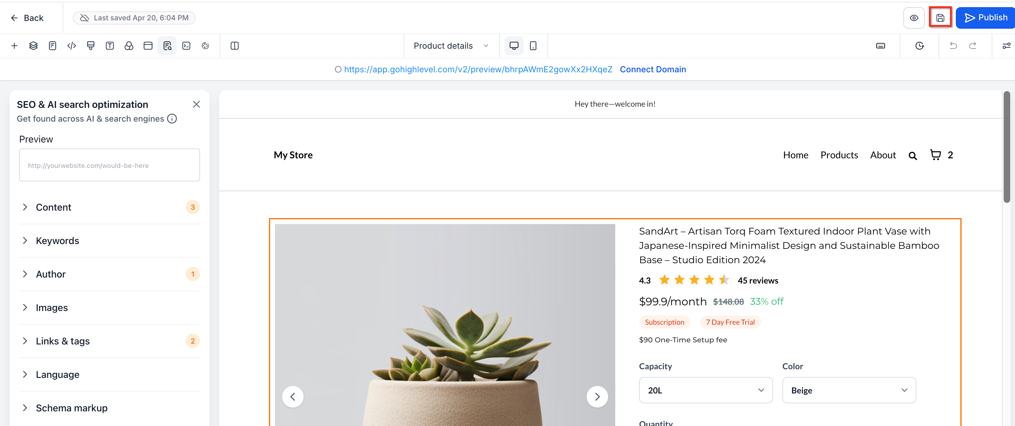
Open Builder Preview or visit a product page on your live store. Click a product image to open the lightbox, then test keyboard shortcuts:
- Press Right Arrow and Left Arrow to navigate between images
- Press Escape to close the lightbox
- Verify that arrow keys no longer scroll the page while the lightbox is open
Keyboard shortcuts only work when Image Zoom is set to Open Lightbox. If you choose Click & Hover Zoom or No Zoom, the lightbox navigation shortcuts will not be available because the fullscreen lightbox does not open.
Best Practices for Product Media
Optimizing your Product Media Layout and zoom settings improves the customer experience, increases conversion rates, and reduces product returns. Follow these best practices to get the most from your product images.
Related Articles
Frequently Asked Questions
Was this article helpful?
That’s Great!
Thank you for your feedback
Sorry! We couldn't be helpful
Thank you for your feedback
Feedback sent
We appreciate your effort and will try to fix the article